For every page you visit in Vivaldi a color is selected. Currently, the engine takes two types of input—a favicon and meta theme-color.
The ten most frequently used colors are extracted from the favicon, resulting in a list of up to 11 (including theme-colour). They are then rated by the following criteria:
- Is the contrast good enough?
- Is the color a midtone?
- Is the color saturated?
A perfect score here is not very hard to get and will give a color 150 points. Additionally, the top three colors are given a bonus multiplier. After all, it means they occur more frequently in the favicon, so they are more likely to be relevant. If present, the theme-color is given an additional bonus.
The winner is the color with the highest score. Changing the Vivaldi theme or contrast requirements can impact which color will be chosen. In practice, the theme-color will win, unless it is a bad match.
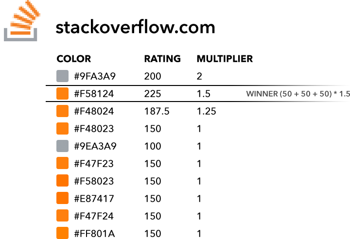
Here is an example of how this works in practice. Note there is no theme-color, so the most frequently occurring color receives a 2x multiplier. Still, it manages to lose to the second most frequently occurring color, as that one receives additional points for saturation. This is a good example of why saturated colors are rated higher.
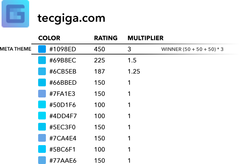
Here is an example of what happens when the page author has specified a theme-color. It receives a 3x multiplier and wins over favicon colors—by a wide margin.


This is a nice insight into Vivaldi, as its not something that’s immediately obvious as you browse the web. Thanks for sharing.
I feel very strongly that the theme colour should carry more weight; indeed, I feel that the theme colour should entirely override the favicon colours. As it is now, achieving the desired page colour requires that the logo in favicon.ico be changed: and forcing the logo to be changed is utterly unreasonable.
It does win in most of the cases, but not all. The reason is that in (my limited) testing that gives better real-world results.
Thank you for the insightful explanation 🙂
And what if a page has neither a favicon nor a theme color? (Like this post, for instance?)
It seems that it will use the color of whatever tab was previously selected. (For instance, if you check out Stack Overflow and go then back to this tab, it will be orange, and if you then try tecgiga.com and go back, this tab is blue.)
That seems a bit random…
What you are experiencing sounds like a bug. I can’t reproduce it, but that doesn’t mean there isn’t something there. Please visit vivaldi.com/bugreport.
What should happen when a page does not supply a favicon is that the favicon request will time out, and the page will be flagged (to avoid waiting for the timeout next time) as not having a favicon. On my machine this results in a the theme accent color being used, which is what I would expect.
Strangely, I can’t reproduce it either anymore. It behaves now as you describe. (I’m pretty sure I wasn’t imagining things…)
The system is a little sensitive, in that it does involve timers. While I believe you, it is hard to fix without a reliable way to reproduce. If it happens again please file a bug report. It will probably end up on my desk. 🙂
I’ve been able to replicate it on v2.0 on a Mac. Does that help with debugging?
If you can reproduce reliably, please provide steps to do so. Best place is probably http://vivaldi.com/bugreport, but right here can also work. 🙂
What if a page hasn’t favicon?.
Without a favicon we fall back to the theme accent color.
In terms of resource usage. What can we do?
You will have to be more specific, I don’t understand what you are asking.
I strongly favor performance and simplicity. My question *was* do you have any tip to speed up Vivaldi. As you don’t know my setup,
it was a silly question.
Cheers
That is a big question, and a little off topic. I will try to give a brief response.
Vivaldi performance can at least be split into two parts. I’ll leave website rendering out, apart from saying that all modern browsers (with Javascript compilers) work best with a lot of memory.
If you find the Vivaldi UI slower than you expect then please file a bug report. The setting I know can have an impact on perceived performance is turning off UI animations.
Maybe I will try to write something about Vivaldi UI performance at a later point in time.
Hey,
Very nice of you. My settings:
Off:
UI animation Show Popup
Show Tab Thumbnails
Fast Forward & Rewind
Hard Acceleration
On Themes “Accent Color from Active Page”
No Third Party
Just one extension: No Coin
Thanks
Can you show us where this snippet lives in the code? I was wondering about this behavior just today, and thought it would be neat to navigate the repo and see how this feature looks in code. That is one of the amazing benefits of open source software!
Loving the browser! Thanks for your work!
You can find the code for this in bundle.js. But it is minified and not easy to read. The theme application consists of two main parts. A library of utility functions and a React HOC (Higher-Order Component) that wraps the entire UI.
If you go to this page https://dlang.org, you will see that the Vivaldi tab doesn’t get changed to the theme colour of the page. The currently focused tab and the other tabs cannot be differentiated, which makes hard to identify the tab, you are currently on.
Au contraire—it does set set the page color to the color of the page. But the detected color is almost the same color as the default Vivaldi theme. You can verify this by going to Settinger › Appearance › Contrast Adjustment and setting it to any value other than “No modifications”.
I am rewriting how contrast is being applied, which will fix this and related issues.
If it prefers saturated colors, why does it chose grey on this website : http://www.gamersyde.com ?
But thanks for the info, I added a script to add the meta and can now force the theme to orange 🙂
I don’t have my debug scripts handy, but there is a lot of grey in that icon, and the orange looks a little smudgy in the favicon. You should suggest they add the orange meta theme color. That will make them stand out much more.
The meta color is used by other browsers too, so there is some benefit for site owners in specifying one.
Thanks for your answer, I’ll suggest them to add it.
How can I turn it off! Makes me go colourblind!
This can be set as part of the theme. Choose a theme without page color, like “Subtle”. Or make your own! 🙂
I just got the new update. How do I change it back? I can not stand this rainbow setting. I want my old color back.
Never mind. I found it and got rid of the color. Annoying.
I don’t think this has changed recently. What was the setting that annoyed you?
Helmers, Thanks. Changed it to subtle. Maybe the options page could be a little more clear how to do it. Almost deleted Vivaldi from my computer thanks to this colourchanges (which sometimes make tabs unreadable!). If I want lasereyes I would have become a welder!
🌈
With such innovation, it’s no wonder I’m hooked on Vivaldi
and all organizations that think this way 🙂
Are we going to get Favicons in Vivaldi any time soon? (Or do we have them? I never see them).
There should be favicons on your tabs. Or do you mean something else? We use them for things like panels and speed dial suggestions.
Is it possible to add a feature, where you can customize the color for a given page/domain and have the browser store that info, otherwise default to the favicon/meta theme color picker?